Accenture.com
Reinventing the biggest tech & design company's digital presence
YEAR
2023-2024
CLIENT
Accenture
ROLE
Visual Identity
Website Design
Design System
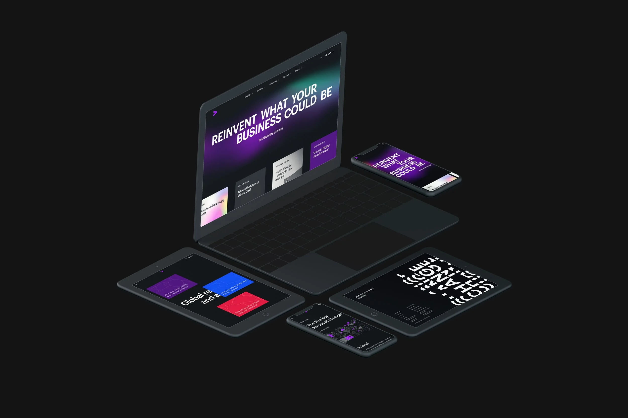
People are coming to accenture.com looking to change. They’re asking what they need to know, what they need to do, and who is the right partner. With more than 7000,000 people working in 40 industries all over the world, Accenture’s website has valuable information for a lot of people, from candidates to clients.
Song needed to take a critical look at the 400K existing pages, see what was there, what was missing and reinvent the site to best showcase our digital expertise and support the brand.
From creating the foundational brand experience to designing the final product, we helped Accenture show who it is and bring to life the future it envisions—with radical relevance at the heart of the change.
Partnering closely with stakeholders and the Accenture C-suite, we reimagine Accenture's digital brand experience, and how it moves, sounds, and occupies the digital realm. We translated it into a new digital identity to make every interaction with Accenture count.
PROJECT IN NUMBERS
80+ components
26M Accenture.com visits per year
52 global markets reached
8 months from start to launch MLP
50+ team members working together
KEY TAKEAWAYS
01. DIGITAL EXPERIENCE STRATEGY
02. DESIGN SYSTEM BUILDING
03. PRODUCT DESIGN
04. ROLL-OUT & HANDOFF
01
DIGITAL EXPERIENCE STRATEGY
Define a vision for digital experience to make every interaction count
Radical Relevance
The site has a seemingly simple purpose: Give visitors insights, inspiration, and know-how; Accenture.com is a companion in our clients’ or talents’ quest for change.
Our overall principle is Radical Relevance; We use this as a a mindset, a compass, and a lens that we apply to everything we design for accenture.com.
Our North Star was to refresh the familiar, make the complex simple, and give our audiences what matters to them. We wanted the design to celebrate progress, the change we bring, the value we create, and the success we share. We wanted to reduce clutter, to let the content that really matters shine. Based on four guiding principles, we have defined how Accenture's digital experience looks and feels, and how it moves, sounds, and occupies the (virtual) space.
From exhaustive to exquisite
Our solution is a 360 experience that is deeply human, celebrates curiosity and expertise, and clearly showcases what Accenture is all about. The design helps visitors navigate Accenture’s broad offering with ease, making the site feel deeply relevant.
The old website was like Wikipedia. It was an expansive catalog of everything we do, while letting everyone say what they want to day. Many were leaving instantly (70% bounce rate) or didn't stay long (1.6 average page views).
The first thing we did was reinvent the center piece of homepage for modern consumption. More than ever before, time is our most valuable commodity. We wanted to meet our audience's needs, regardless of their attention span. Therefore, we built the foundational interaction pattern – Glance (scroll), Skim (hover) and Absorb (click for content in detail). Homepage and main pages have a single stream of content, unfolded little by little, through delightful and purposeful interaction.
Create something new, without creating something new
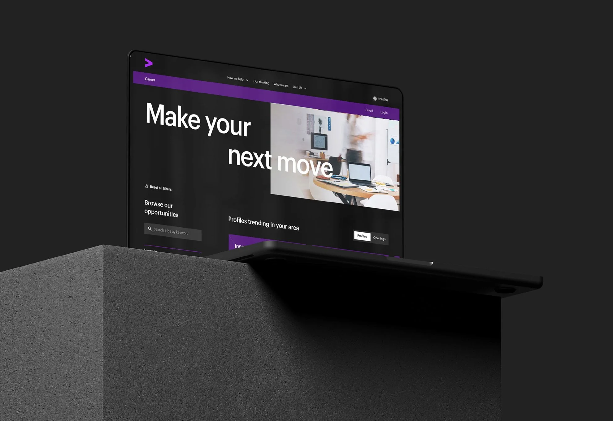
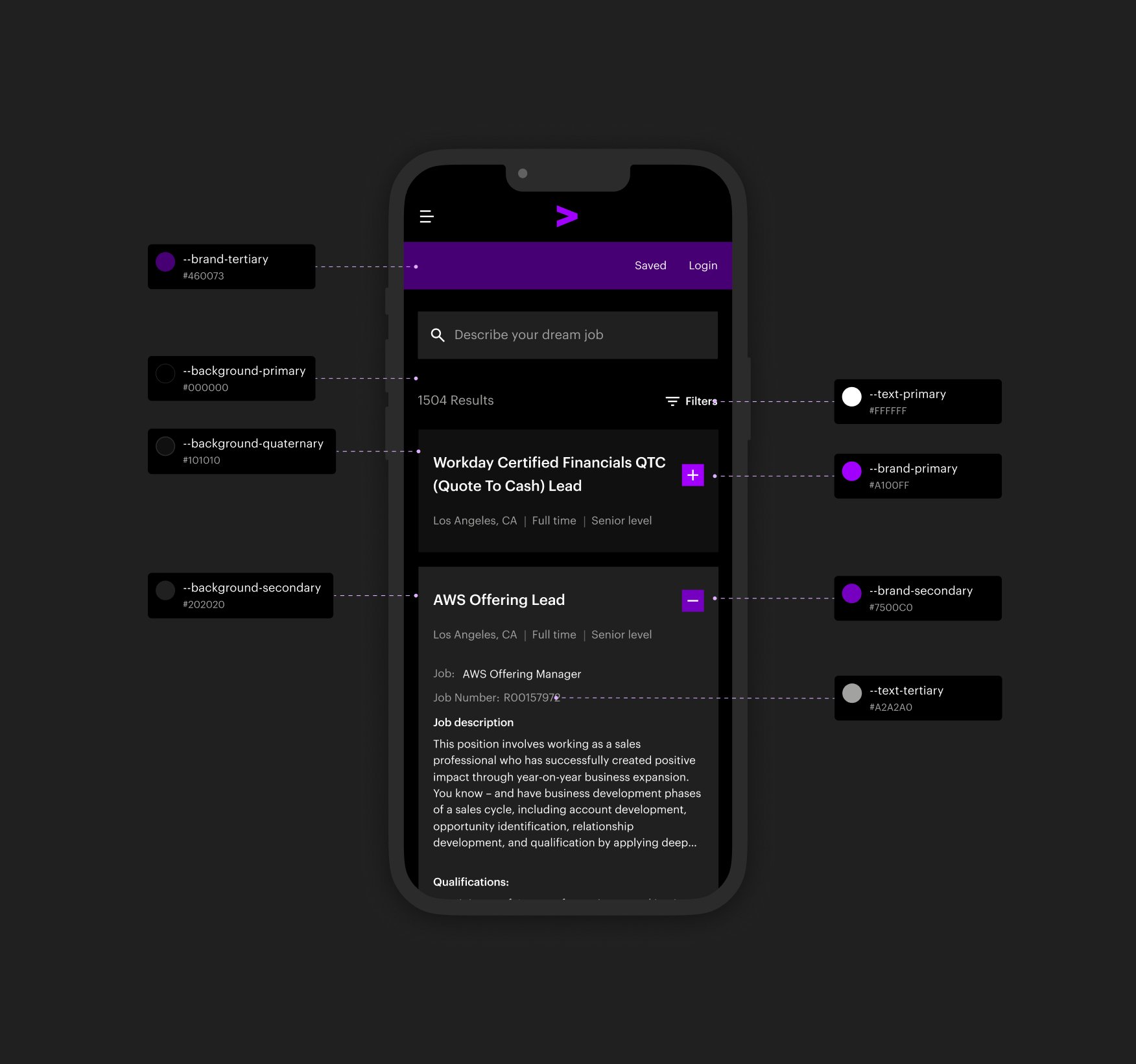
When it came to the visual expression of the website, the main challenge was 'how to create something new without creating something new?' Accenture's brand is more recognizable than ever, so we needed to elevate what works. We started with typography, colors, and neglected visual assets – illustrations and gradients.
We streamlined font weights were streamlined from 9 to 3, making the Accenture digital experience more relevant, consistent, and accessible. Brand colors were also reduced and restructured from 60 to 24 to be optimzed for the digital environment.
Choreography for a dynamic brand
Brands are not static. Motion is a key element in expressing ourselves as a digital-first company. When we think about motion that is authentic to Accenture, we want to embody movements that capture the magic that occurs at the intersection of technology and human ingenuity.
Rooted in Accenture's original motion style, that bring the emotional connection, that makes the website alive. We created a consistent choreography for components and interactions—from functional buttons, expressive page transition, to kinetic elements. The website experience works in harmony.
02
DESIGN SYSTEM BUILDING
Make the complex simple, design to scale
Based on the dynamic, systemic brand identity, all visual elements have been smoothly translated into building blocks of the Finnish landscape in digital form. The library consists of over 40 flexible components, which have been used to shape all layouts across four websites and five different campaign pages. This benefits both developers by streamlining the implementation process and content creators by equipping them with flexible template selections.
Lay the foundation for unified design
Throughout this project we’ve streamlined the visual identity, enriched the visual language, and put content into system that scales. We’ve defined and designed signature moments, created motion principles, guidelines and playbooks, as well as guidelines for photography and video content.
Our initial vision has evolved into an extensive design system which future proofs the look and feel of the site, and makes content creation simpler, quicker and easier, while ensuring a recognizable and engaging experience for audiences.
Zoom in & out for consistent flexibility at scale
Accenture needed new landscapes. The old website had one-size-fits-all pages, which made its digital landscapes static, duplicative, and long-winded content regardless the purpose. We were also keen to craft a not a classical approach, but immersive and cinematic look and feel. We constantly zoomed in and out the entire picture. The aim of the journey: to meticulously refine our component set until everything felt unified yet flexible to customise.
80+ components for 72,000 pages
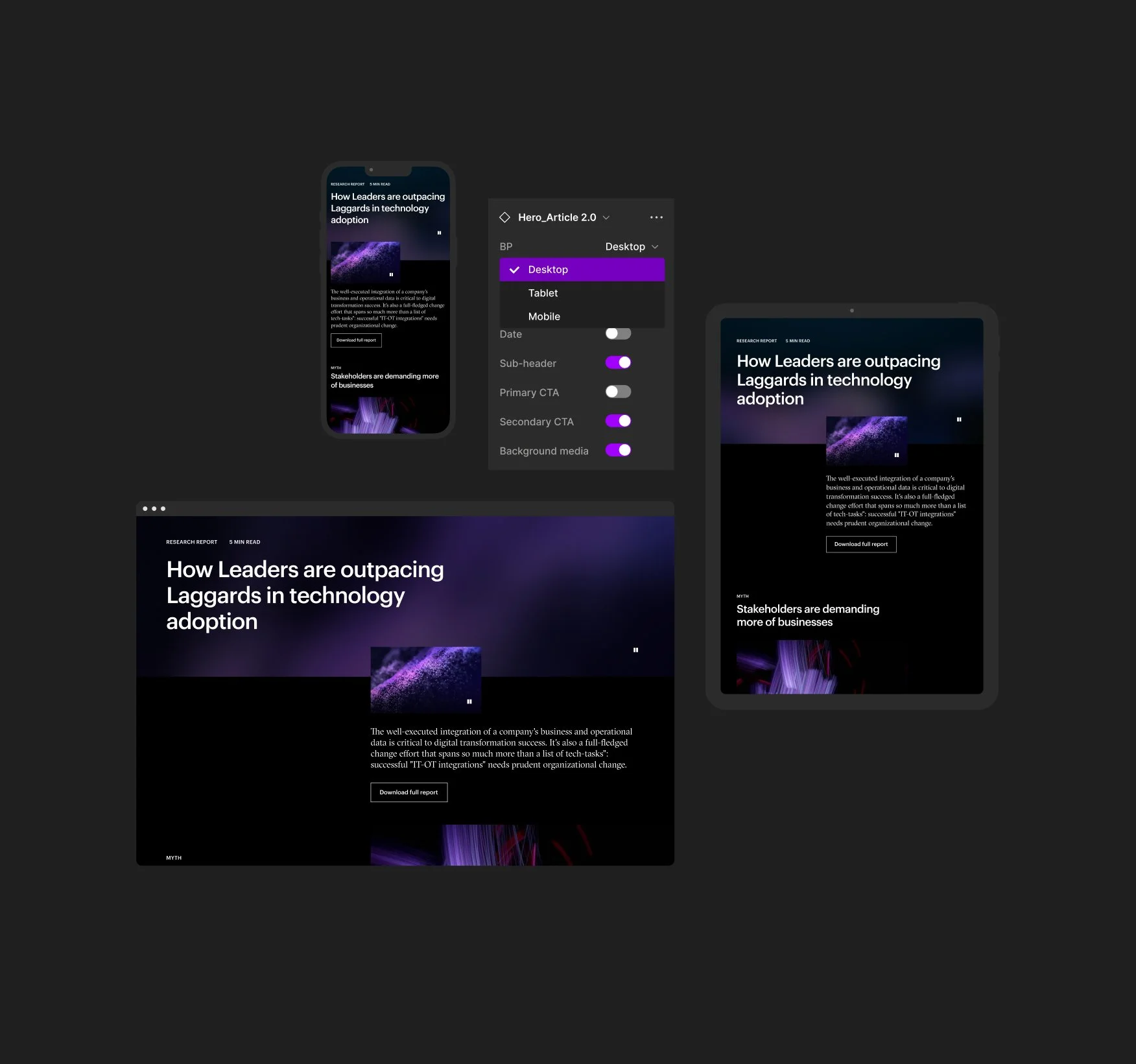
With the rigorous foundation and +80 components, the RAD design system has come to life. Rad is a single source of truth for global digital designs living in one component library. Components are strategically updated over time, meaning the design system is treated as a product that will never stop evolving, while simultaneously keeping the brand universally aligned.
03
PRODUCT DESIGN
Design for scale—from design system to product building
Streamline collaborations
We did this, by working collaboratively with marketing and communications teams, developers, design teams and senior stakeholders globally. Through a vigorous sprint process, we designed a component-based approach, allowing for ultimate flexibility, adaptability and ease of use.
Change is constant in life and on Accenture.com. We celebrate progress and redesigned the site to allow visitors to be part of the experience.
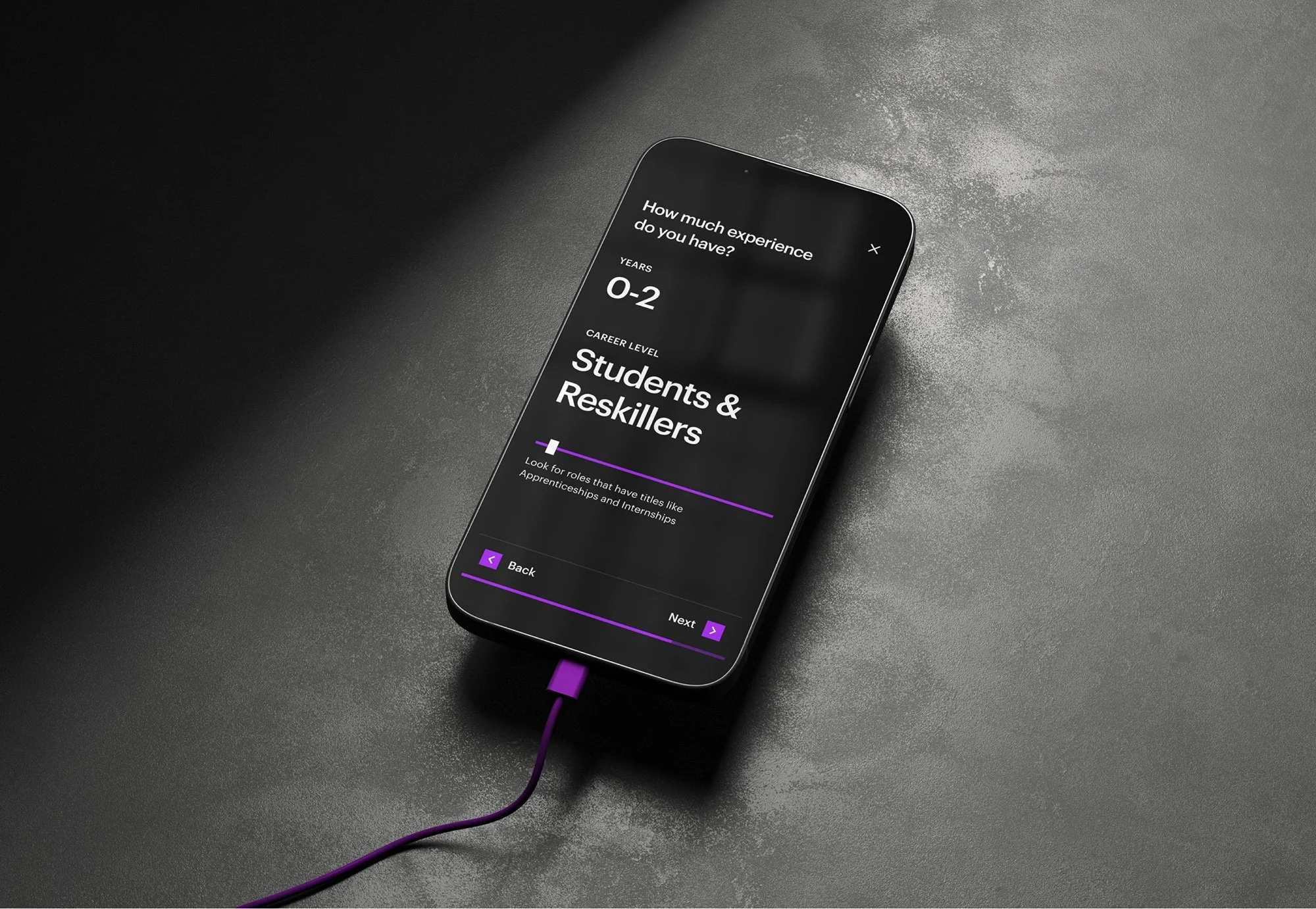
Since the brand experience foundation phase, we have conducted multiple user validation sessions on milestones—validating concepts and the first MLP launch. Based on feedback, we adapted to our audiences on what matters to them. Cards and article pages are good examples.
04
ROLL-OUT AND HANDOFF
Continuing success...
Global adaption to 52 markets in 13 languages
A design system creates real value when it is adopted consistently across a global organization. To support this, we worked with Accenture to define strategies for driving adoption and ensuring the ongoing maintenance of components and documentation. These foundations were essential to the system’s long-term success.
The impact
81%
Page volume reduced
We reduced the global number of pages from 15,000 to 2,800 pages, creating significant operational efficiencies.
˜29%
Bounce rate decreased
The overall website bounce rate decrease by up to a third from the baseline, depending on the point of entry to site.
20–70%
User Engagement increased
More users actively engage and get absorbed in the content, taking the time to consume or explore it thoroughly.
CREDITS
DESIGN & DEVELOPMENT
Accenture Song